Go Green Logo Project

Go Green is a startup cannabis delivery service in the San Francisco Bay Area that caters to house-bound medicinal clients.
The Goal
Go Green’s goal was to create a logo and brand that represented a high-end and professional cannabis delivery service for medicinal patients. They were not looking for the typical cannabis leaf logo, as they wanted to build a luxury brand. They also sought out to build a high-end reputation where they would not need a literal representation of the company. Overall, the goal was to stand out from the competition.
They needed a logo symbol to represent Go Green, along with typography and the company name. The desired design needed something classy and unique that would stand out on its own without the use of literal representation of a marijuana leaf.
Go Green’s target audience are medical cannabis users in the San Francisco Bay area who are too ill to travel to a dispensary.
The Solution
Our Project Managers first gathered everyone together for a kickoff call to determine if we were a good fit for Go Green. Once we decided to move forward, we collected vital information to begin the project and craft a proposal. Once Go Green ‘crossed the t’s and dotted the i’s’, the Smack Happy team dug in.
By outlining goals, needs, pain points, requirements, and inspiration into a single, creative brief the designers were able to develop the first sketches.
This client really wanted a luxurious and versatile design with elegant fonts.
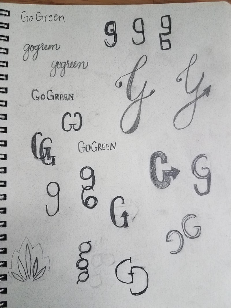
Our graphic design team then sketched out some ideas and began brainstorming. As this was a collaborative and internal effort—each designer brought a series of sketches and ideas to the table and reviewed them together, mixed and matched, and selected what to take into the next round of the effort: digitizing the ideas.
Sketches:
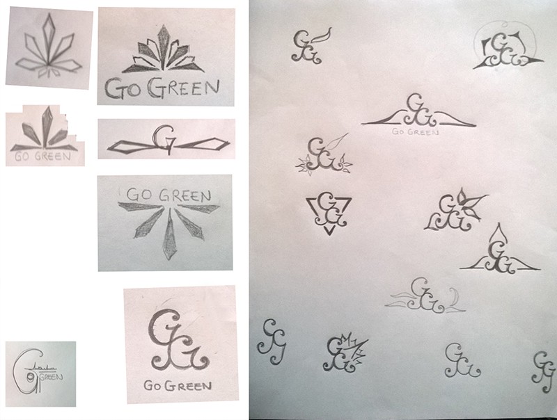


Designer 4
Once we [collaboratively] explored and brainstormed all of the sketched options, we selected a few favorites and went to work digitizing the designs. All of the designers provided digitized examples with different fonts, color combinations, and styling.
The Result
After a few collaborative iterations, Go Green had chosen their most favorite concept. Along with the final files, we delivered a style guide including font names and colors suited for web and print.


An Additional Ask
The client loved the final logo so much they asked us to duplicate it with the color green!
