Go Green
The Brief
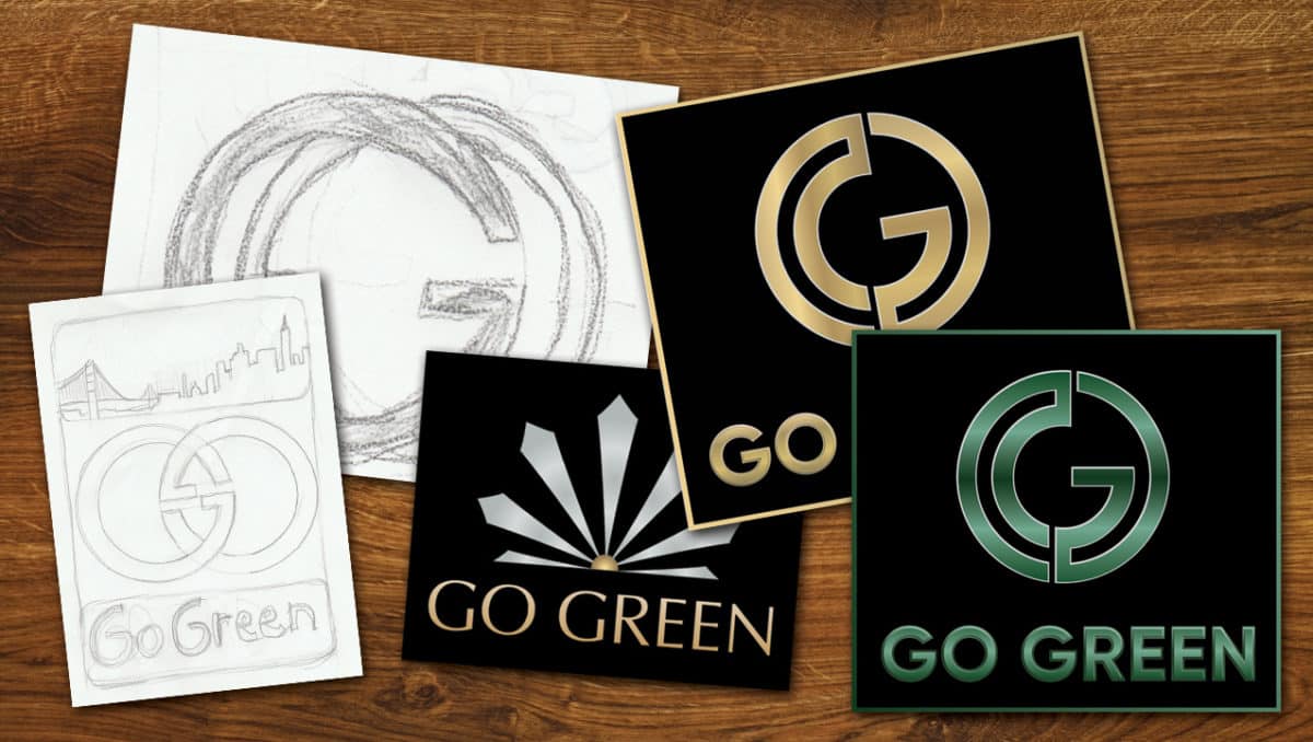
Go Green is a startup cannabis delivery service in the San Francisco Bay Area that caters to house-bound medicinal clients. The goal was to create a logo and brand that represented a high-end and professional cannabis delivery service for medicinal patients. They needed a logo symbol to represent Go Green, along with typography and the company name. The desired design needed something classy and unique that would stand out on its own without the use of literal representation of a marijuana leaf.
Our Approach
Three designers began to design the first round of sketches. Once we [collaboratively] explored and brainstormed all of the sketched options, we selected a few favorites and went to work digitizing the designs. All of the designers provided digitized examples with different fonts, colors combinations, and styling.
The Result
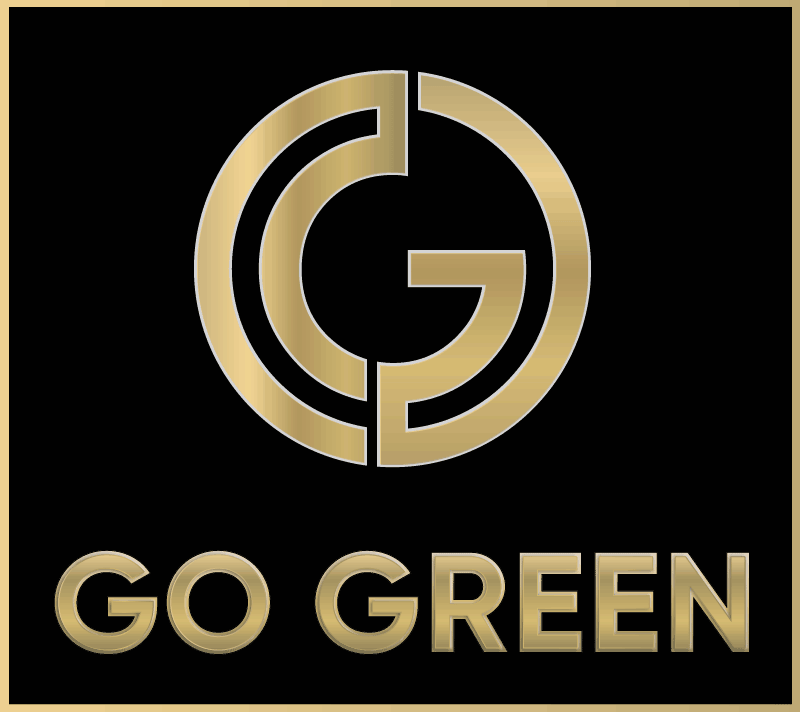
The client loved the final logo so much they asked us to duplicate it with the color green. The final files were delivered as .eps, .jpg and .png for use in print, web, and social media. Along with the files, we delivered a style guide with the font names and colors for RGB and CMYK.

Industry
Health & Wellness
Our Role
Logo Design
Launch
September 6, 2017
From the Client
We don't have a testimonial yet from this client!