Acme Workwear
The Brief
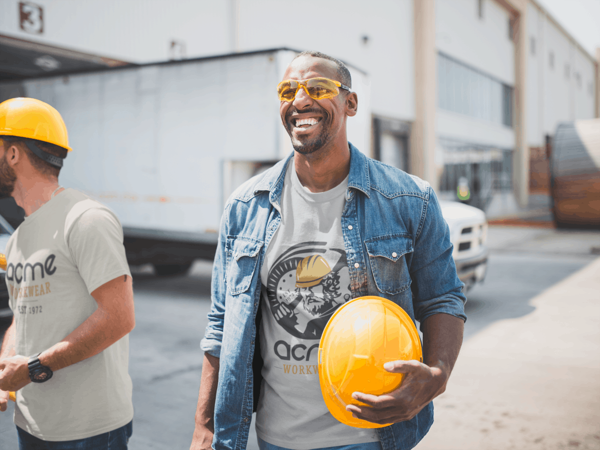
Chris, owner of Acme Workwear in San Francisco wanted a new logo design to begin incorporating the logo in more ways – from business cards to apparel for employees to the new website, social media promotion and email signatures. More than anything they needed a logo to support the amplification of their business for the next several years.
Keeping the importance of branding and the company’s rich history in mind, they wanted a logo that spoke to the blue-collar worker one that is recognizable and also dynamic.
Our Approach
We began with a questionnaire to get to know the brand a little more, asking questions about the details behind the brand, the customers, and the needs of the business. After some discovery, we reached the first approach to design several concepts that spoke to the brand’s personality: trustworthy, professional, and dependable. Considering the likes and dislikes of colors, styles, and meaning – Chris chose one to move forward with. The story behind the chosen concept really resonated with him.
The Result
The chosen concept went through a few iterations, however, after understanding the significance of the story behind the logo – Chris and his team were extremely happy with the results.
Additional tweaks and details include:
- Styling the “A” in “Acme” more definitive
- Troubleshooting with the final files and the embroidery/screen printing machines at the store to make colors more vibrant
- Tweaking and saving for additional versions of the logo
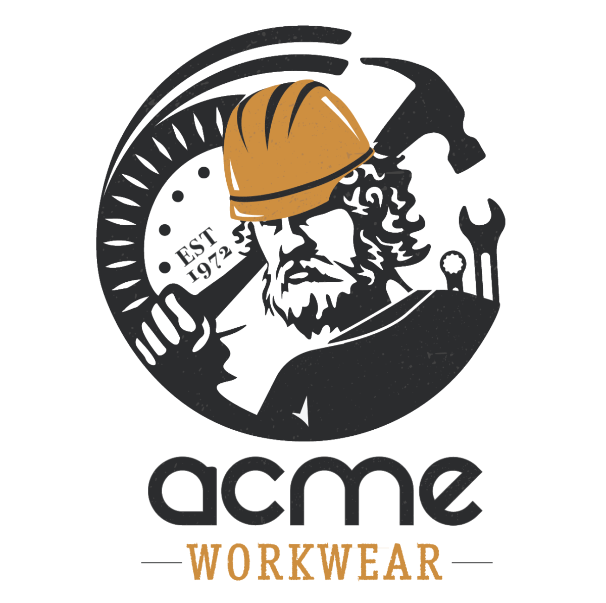
- Adding a custom hardhat
The Additional Story Behind the Final Logo
In the logo, you’ll see a strong figure in the center of it all. His name is Hephaestus, the Greek god of blacksmiths, metalworking, carpenters, craftsmen, artisans, sculptors, metallurgy, fire, and volcanoes. Mythology says that he was at the center of the manufacturing industry. In some stories of Greek mythology, Hephaestus was Zeus’ son who was cast off Mount Olympus. Well, as the ultimate symbol of blue-collar work we brought him back!
We felt the combination of this figure, paired with more modernized tools and workwear was the perfect mix of design as a new and inspirational modern-day symbol that represents the strength, resilience, and commitment of Acme Workwear to both their customers and to the Bay Area.
Industry
B2C, Local Business, Skilled Trades
Our Role
Concept, Logo Design
Launch
June 14, 2020
From the Client
Just an amazing experience from start to finish. Smack Happy built my company logo from scratch and I was so impressed with how attentive they were to every little detail in the process. They blend creative design with professional, prompt responsiveness. They met every deadline and created a beautiful logo without much direction from me – yet they were still able to understand my vision. Highly recommend that you work with them.


