Castro Psychotherapy
The Brief
Having been given a design from a previous designer that didn’t quite embody the vision they wanted, Dr. Sean Riley was looking for a cleaned-up graphic design for building signage that complimented the structural aesthetic, would be visible from a distance, and appropriately advertise the business by directing people to the website. The intention of the sign is to help others find the business more easily, considering they share the location with other local businesses in the area.
Our Approach
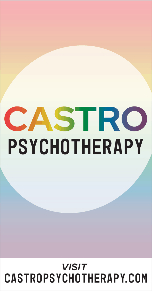
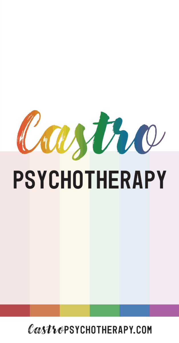
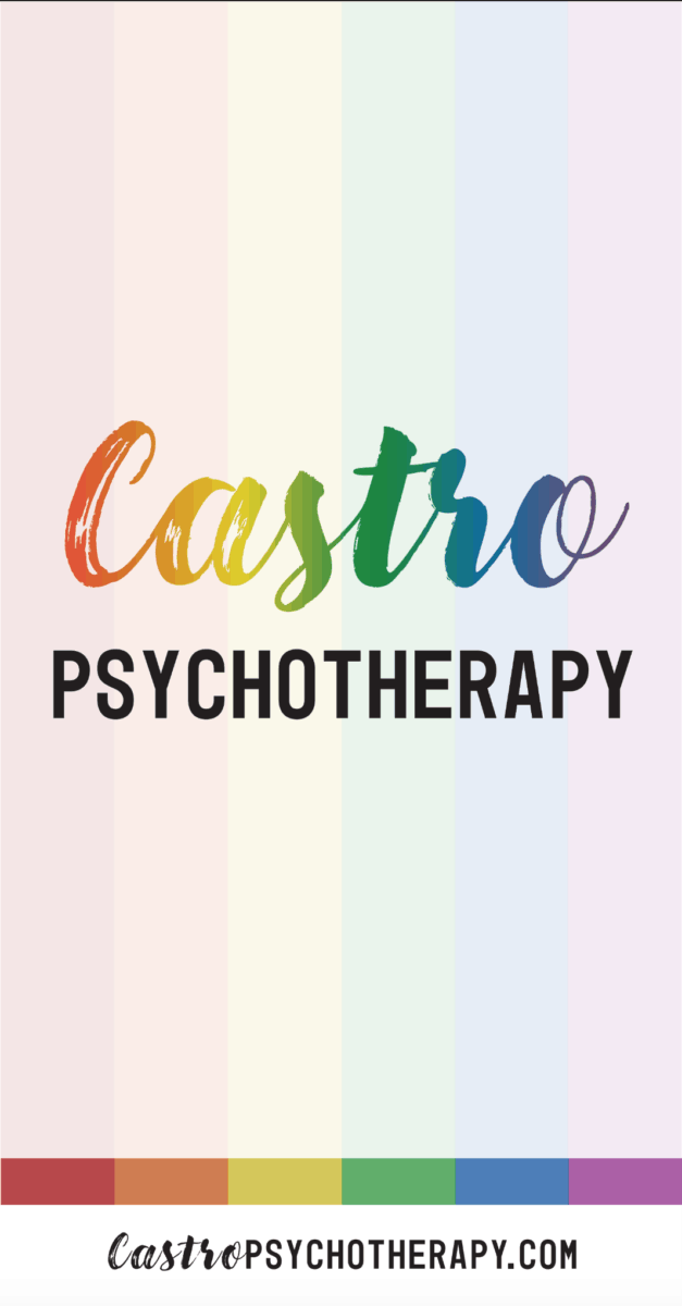
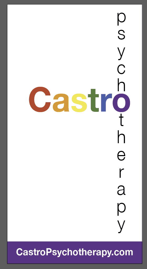
While website design is our bread and butter, we are always excited to be able to work on other design-related projects. This project was especially cool because the sign was larger in size (34″ wide by 65″ tall) and would be prominently displayed on a building located at the intersection of Market, Sanchez, and 15th Streets in San Francisco. After we met to discuss the details of the project, we worked with Sean and his colleague over several weeks to really make the sign unique. First, we started with mockups from three designers to choose an overall look and feel. Over a few weeks’ time, we collaborated on iterations of the design including variations of fonts and font aesthetics by sending mockups for them to provide feedback on.
The Result
After mocking up the final two iterations on a photo of the building itself, they moved forward with their most favorite version. Finally, we packaged the file to send off to the printer of their choosing. We were delighted with the results. The feeling was likewise, as Dr. Riley was very happy and grateful for how everything turned out stating, “We’ll be sure to use Smack Happy again!“


Industry
Health & Wellness, Local Business, Skilled Trades
Our Role
Concept, Graphic Design
Launch
October 10, 2019
From the Client
We don't have a testimonial yet from this client!