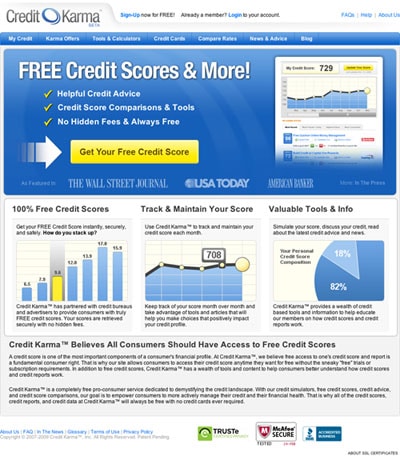
Home Page Formula
If you’re offering a service online, there is a particular formula most sites use these days. The top half of the page (above the fold) has a colored rectangle area, often with rounded corners. One-half of this rectangle spouts the company’s tagline followed by a bullet list of features and/or benefits. Below this list is a big shiny button enticing you to click and sign up – an important call-to-action. On the other half, you’ll find an image, or more often a screen shot of the product.
Below the colored rectangle is usually a three-column area. In each column you’ll find more information about the product; product highlights, how it works, testimonials, or something of the like explaining the product even more.
One example of a site that uses this formula is Credit Karma. They do a great job of explaining exactly what they do in the 2-3 seconds they have when a user visits their home page. The shiny yellow button is large with a very clear call-to-action, giving the user focus and direction. They also do a great job in the three columns telling the user how their product will be helpful.
Credit Karma has a great home page for an online service that I would gladly use as inspiration. It has several of the important components that Jakob Nielsen claims a great home page needs:
- Logo
- Navigation
- Tagline
- Short paragraph stating what you do (the bullets in this case)
- Focus and direction (the sign up button)
