Top 10 Best Newsletter Landing Page Examples

An effective marketing strategy includes newsletter landing pages. As a result, we will be examining landing pages for various businesses and pointing out how and why their designs work well as part of their sales funnels.
One of the key concepts to remember about these landing pages is that a polished newsletter landing page is a must for everyone, from small businesses to industry titans. They’re useful because they assist in pushing consumers through their journeys by design.
In case you’ve never considered a newsletter landing page, we’ll discuss what they are in addition to current best practices to make them effective.
We’ve also taken the liberty of examining 10 different newsletter landing page examples to explore why they’re highly effective at what they do. As you read through them, our goal is to provide you with actionable suggestions you can apply to your own landing pages.
What Is A Newsletter Landing Page?
You’re likely familiar with a traditional landing page where maybe you talk about your business, or perhaps you tell visitors about your story. A newsletter landing page is a little different but is still a critical part of your funnel.
Newsletter landing pages, also known as squeeze pages, are specifically designed to get your visitors to sign up to receive your email newsletters. It’s a page that doesn’t have to be complicated to have a successful conversion rate. In fact, a simple page may perform better than one that is overly complicated.
For example, your newsletter landing page can be a single high-resolution and quality image, a short blurb about your newsletter, and a signup form. At the bare minimum, that’s all you need to be effective.
What Are The Best Practices For An Effective Newsletter Landing Page?
To help you create your own newsletter landing pages.
1. Be SMART.
When it comes to your goals, you want them to be SMART goals. SMART stands for:
- Specific
- Measurable
- Achievable
- Relevant
- Time-bound
All goals need to be specific to your newsletter landing page. Examples of what they can pertain to include visitors per day, visitors turned into subscribers, or just subscribers.
You’ll notice that each of these specific goals are also measurable. You can easily measure the number of visitors your landing pages gets every day while also measuring how many visitors convert to subscribers.
To set these goals, you need to also consider how many visitors your page actually gets. By doing so, you can create a goal that is achievable because it’s based on real data about your current situation.
Relevancy is especially important because your page ought to relate to your newsletter in a direct way. Maybe you’re targeting people on mobile devices. If that’s the case, you don’t want to look at visitors from a desktop because they’re not your target.
Setting an end time is also critical. You don’t want to say you want to boost visitors to 20% without an end time. Setting a time limit creates milestones you can set and have a chance at accomplishing. Another important part of creating time-bound goals is that they must also be realistic. Don’t set out to accomplish something in two days when it may realistically take 30 days.
2. Persuasive copy is a must.
Nobody likes to get spam in their inbox, so your newsletter landing page needs to provide compelling information to get people to want to sign up for your newsletter. Suggestions for persuasive copy includes:
- Focusing on benefits
- Establishing yourself as an industry expert
- Specific CTAs
- Simple language that’s easy to read
If visitors can’t identify why your newsletter is valuable to them, they won’t want to give you their email addresses. Copy that proves your business can be trusted is also critical to persuasive copy. Examples of trust can be included by simply sharing your backstory or case studies for others you’ve worked with.
Lastly, you need to make sure your CTAs are simple and specific. Tell visitors to sign up if that’s what you want them to do. If you’re presenting your business as a club, then tell them to join it. If you’re giving an incentive away like a discount, tell your visitors to claim their discount.
Also remember to keep the copy simple. Don’t use industry jargon if that’s not your audience. Be sure to break up your paragraphs to make them easy to read. Before you make your newsletter landing page live, don’t forget to edit for errors like misspellings or grammatical errors.
3. Share social proof.
Social proof is all about proving authenticity to who you are and what you do with testimonials, videos, and strategically placed headlines. Don’t shy away from bragging about how wonderful your business is and how much it has helped others.
When you share social proof, you also want to display it above the fold. The fold is what a visitor to your site will see first before they have to scroll down your page. To maximize your social proof, consider the following:
- Photos from happy clients, with permission of course. Displaying photos adds to your credibility, so if you can get permission to do so, share them.
- Emphasize complimentary excerpts. Many times, clients will share what they’re so happy about, but the compliments can be on the longer side. Instead of sharing the entire review, only share an excerpt that really helps your business shine.
- Ask for reviews if you don’t have any. It may feel awkward to do so, but it’s okay to ask for reviews or testimonials. You’ll find that when you have a happy customer, they’re usually happy to oblige.
4. CTAs should be easy to identify.
One of the best examples for CTAs is on Amazon. There’s no question as to what they want you to do and their CTA is easy to spot on the page. Your primary CTA should always appear above the fold because easy to recognize.
You also want to have your CTA placed elsewhere on the page that feels natural while scrolling. Be careful about how many times you place your buttons or links though, because too many can feel pushy to your visitor.
As you design and plan your CTA’s placement on your newsletter landing page, you might also consider using contrasting colors. Color choice should make your CTA stand out and draw your visitor’s eyes so they do exactly what you want them to do, which in this case, is to sign up for your newsletter.
5. Visual aspects are critical.
The pictures and videos you choose are just as, if not more, important than the copy. People tend to recognize the meaning behind images faster than words, so you want to choose images that work for what you’re trying to accomplish.
Make sure you always use high-quality photos that can scale well. Sometimes, that might mean using vectors as opposed to a .jpg or .png file. Remember, high resolution doesn’t mean it has to be a large image because that can cause a loading lag. If it’s too big, you might need to use a file compressor that retains the quality without compromising for load time.
Videos are also a big deal as engaging embedded videos can have a significant positive impact on your overall conversion rate. As you select your videos, you want to remember your SMART goals and keep your videos relevant to your offer.
For example, if you are giving away a discount as your incentive, it would be a good idea to have a video that tells your visitors why the discount is a great idea. Video testimonials are also an excellent addition to engage potential customers.
6. Keep your page simple.
The goal of your newsletter landing page is to get people to subscribe to your newsletter, so that’s where your focus needs to be. Get rid of any visual clutter that doesn’t add to your focus. You might even consider moving the navigation bar so people only see it if they’re looking for it.
Anything that doesn’t pertain to your goal is a distraction. The only exception is if your newsletter landing page also happens to be your homepage. Plenty of businesses do have this format on their site, but it’s better to have a dedicated landing page for your newsletter signups for maximum effect.
Best Newsletter Landing Page Examples
We’ve talked about what makes a good newsletter landing page and why you need one, so now it’s time to discuss 10 newsletter landing page examples that stand out from the crowd.
1. 1822 Denim

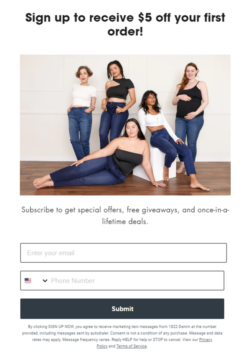
At 1822 Denim, their newsletter landing page is an excellent example of what to do to get people to subscribe. You’ll note the high-resolution image that shows women of all sizes and ethnicities which is right in line with their entire brand.
It’s also simple and straightforward. You immediately see the benefits to signing up for their newsletter. You’ll get a discount for signing up (incentive). They further promise to provide special offers, free giveaways, and exclusive deals to their subscribers.
The only thing that it could improve on is maybe adding social proof, but the simplistic design that speaks to who they are and who they target is perfectly aligned with the company.
2. Maud’s Coffee

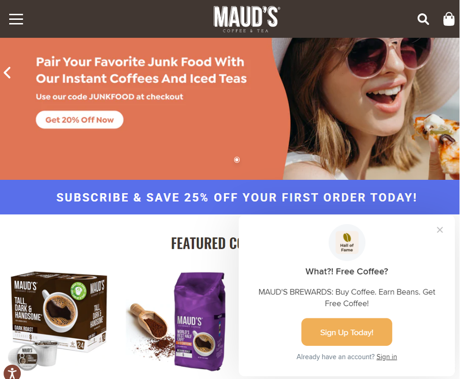
Maud’s Coffee has their newsletter landing page incorporated into their homepage. Their subscription pitch is right up front when you land on their homepage. It is designed to grab your attention with immediately engaging copy saying, “What?! Free Coffee?”
They know their demographic and are getting people to sign up with their tantalizing offer to get free coffee by signing up not only for a newsletter, but for a free account. The CTA is clearly visible as it contrasts directly with the pop-up that comes up.
Images are also excellent choices as they show someone who appears personable and looks like they’re enjoying life. Add the product graphics and they have an excellent combination to get people interested in what they have to offer.
To improve the current design, they should consider adding social proof above the fold. Overall, it’s still a good example of something that would work.
3. Hot Chocolate Design

This brand is all about pushing the envelope with funky and fun fashion designs. They play around and pick images that align with who they are and what they want to present. You can tell by looking that they’re a little different from the rest.
Hot Chocolate Design gives subscribers a discount when they sign up for their newsletter. The information they ask for is easy to provide and the copy is simplistic. However, the copy could be more persuasive, but the layout is excellent.
4. CoffeeCup Software

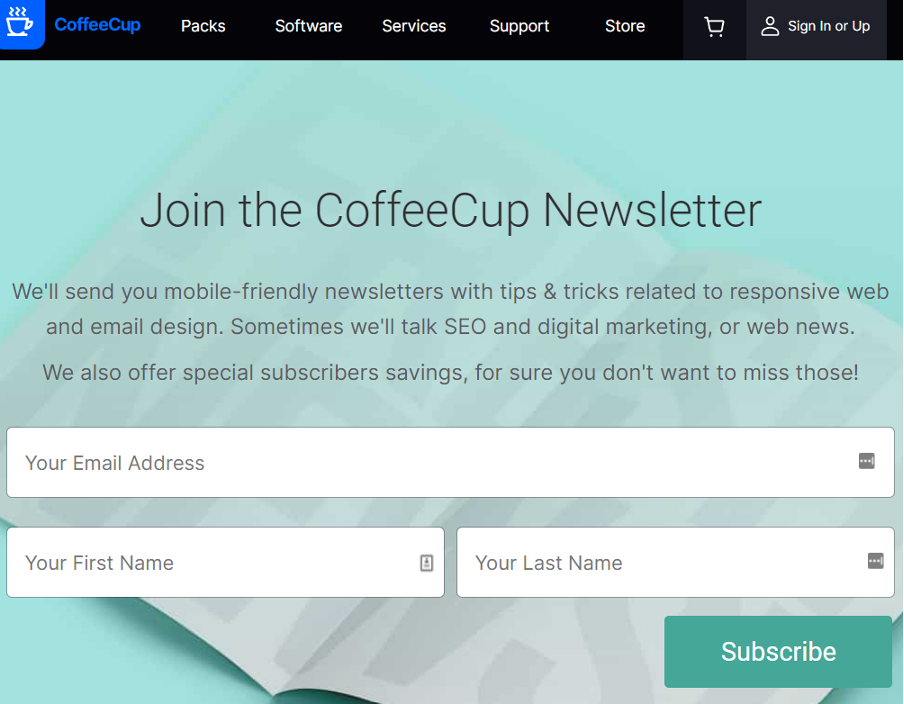
CoffeeCup Software has an entire dedicated landing page instead of a pop-up on their homepage. Its design is simple and the copy is excellent. You know exactly what you’re signing up for when you see the page. The tone is also persuasive but not pushy.
Looking at the information requested, it’s straightforward and not at all intrusive. Additionally, the button text contrasts clearly with the button itself.
The only improvement that could be made here is about the button color. It could be more obvious or contrasting on the page, but overall, it’s a great design and layout.
5. Vegan.com

People will sign up for this newsletter because Vegan makes it easy. They come across as human and more personal. By recognizing that people don’t like spam, the copy makes it compelling for visitors.
The image is perfectly aligned with their brand, too, and it looks appealing to people who visit the site. The layout is simplistic and still informative.
When you add the subscribe button that has the contrasting text, everything draws the eyes down to exactly where you want a visitor to look.
6. RetailMeNot

RetailMeNot has a popup integrated into their landing page to get people to subscribe. The design is simple and has excellent contrast.
They know their audience and asks an easy question to engage.
7. Highlands Winery

Highlands Winery is well known in the Napa Valley area for having excellent wines. The color scheme is aligned with their overall brand and the newsletter signup is easy to follow.
When it comes to the images they have chosen to use, they’re clearly relevant to the winery.
Color contrast is also good when it comes to the submit button at the bottom of the sign up page. Overall, this is well done and is likely to convert well.
8. Old Navy

Old Navy is a household name, and even they have a sign up for newsletters they still rely on to get people to convert to customers. Their newsletter landing page is aligned with their color scheme and brand design.
It’s also simple in its layout and draws the eyes downward. Visitors get a a discount and the copy is compelling.
By offering exclusive knowledge and offers, it makes visitors want to subscribe. It is clutter free and doesn’t include the navigation bar. The CTA button is also easy to spot and the contrast is excellent.
9. Electronic Arts

EA Games is a big name in the gaming industry. They also have an excellent newsletter sign up page. The design is perfectly aligned with their brand and color scheme.
The copy is also compelling as it lets visitors know they can expect the latest updates, products, and events in their newsletters.
As you look at the page, you’ll also see that the fields are easy to fill in and not intrusive. Your eyes naturally work their way down to the sign up button that also has good contrast.
10. CompTIA

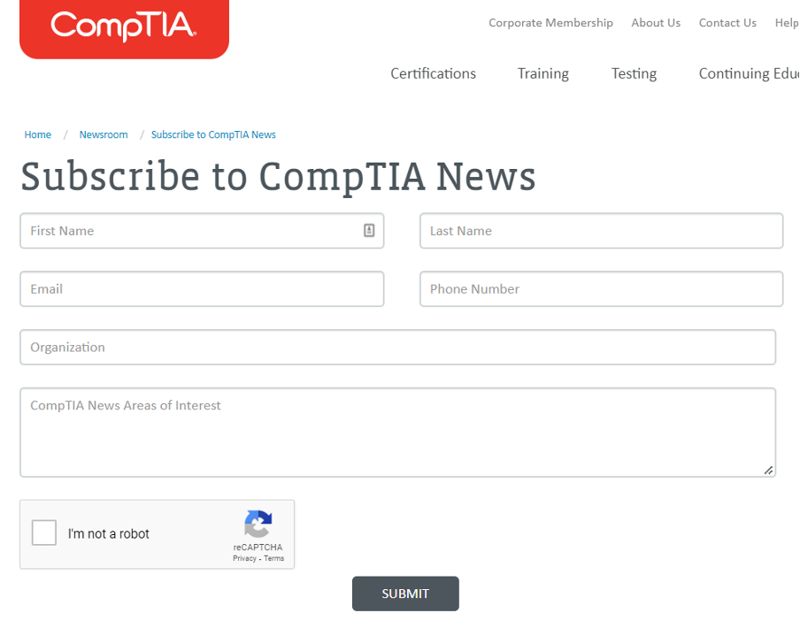
CompTIA is an IT industry mainstay. It is well known and a leading authority on all things tech. The design and layout is clean and simple.
There are a few fields to fill in, but it works for their target demographic which consists of IT professionals and those interested in IT. The contrast and colors make sense for their newsletter landing page.
Wrapping Up
To create landing pages that work, you just need to remember a few principles. Don’t forget to be specific about your goals and make sure they’re measurable. Your goals also need to be achievable, relevant, and time-bound.
Copy also needs to be compelling to ensure people respond to what you show them. Images should always be relevant as should videos if you have them. Social proof is always a good idea if you have it. Make sure you use high-resolution photos and engaging videos if you’re going to add a visual component.
Most of all, remember to keep the pages simple if they’re standalone pages. It’s always a good idea to eliminate distractions when and where you can to encourage the best conversion rates. With the advice you see here and the examples that have been shared, you’ll be well on your way to creating a newsletter landing page you can be proud of.
About the Author

Anthony Tran is the Director of Marketing at Beaver Builder. He loves Starbucks iced coffee, watching NBA basketball, and catching the latest Marvel movie.